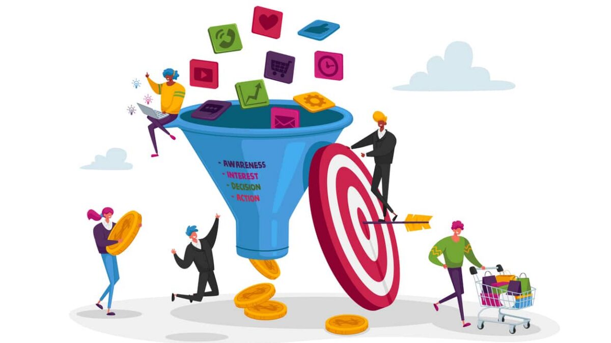
Understanding the Human Mind Behind Every Click
In B2B marketing, conversion optimization is often treated as a technical challenge—adjusting buttons, layouts, and calls-to-action to drive incremental improvements. Yet the most powerful conversion gains don’t come from design tweaks alone; they come from understanding the psychology behind user experience (UX). Every visitor on a website brings cognitive biases, emotional triggers, and decision-making patterns that shape how they interpret value and credibility. The best-performing digital experiences align with these psychological realities, turning friction into flow and curiosity into commitment.
According to a 2024 Gartner report, 88% of B2B buyers say the digital experience of a supplier is as important as its products or services. In an environment where complex decisions are made by committees and cycles can span months, the user experience must not only communicate clarity—it must build confidence and reduce uncertainty at every step.
At its core, UX psychology is about mapping human thought to interface design. The visual hierarchy, interaction flow, and messaging architecture of a site all influence subconscious cues that determine whether a user feels trust, competence, and alignment with your brand. When a B2B buyer lands on a website, they’re not seeking entertainment—they’re seeking reassurance. They want to know, “Can this partner deliver? Do they understand my challenges? Is this worth my time?”
Why Psychology Matters More in B2B
Unlike B2C, B2B conversions require multiple layers of validation—logical and emotional. Prospects must justify choices to peers, superiors, and financial stakeholders. This dual-path decision process means your website must address both rational reasoning (ROI, proof, credibility) and emotional trust (empathy, authority, alignment with values). Research from Harvard Business Review found that even in B2B environments, emotional connections drive more long-term value than rational satisfaction alone.
In other words, UX design that triggers psychological trust and cognitive ease can accelerate the path to conversion more effectively than discounts or promotions ever could.
UX as a Behavioral Science
At Webolutions, we view UX not as a creative discipline alone but as a behavioral science framework. It bridges neuroscience, design, and communication strategy to influence how users perceive and interact with digital experiences. This means every layout choice, typeface, and visual cue carries psychological weight. White space can signal credibility; micro-interactions can reduce anxiety; clear navigation can enhance perceived control.
The essence of psychological UX design lies in aligning digital architecture with the way the human brain processes information—through pattern recognition, storytelling, and cognitive shortcuts (heuristics). When those align, conversions feel effortless because the experience feels “right.”
Setting the Stage for Optimization
This article explores how the principles of psychology can be intentionally woven into B2B website design to increase conversion performance. We’ll examine:
- The cognitive science of first impressions and credibility
- The role of cognitive load and decision simplicity
- Trust signals and authority heuristics that guide subconscious trust
- The use of visual hierarchy to influence attention flow
- How emotional design and micro-interactions reinforce engagement
- The psychology of social proof and narrative framing
- The science of confidence and closure in conversion paths
Each section will unpack not only theory but practical design applications—how to translate behavioral insights into measurable ROI outcomes.
Strategic Takeaway:
Conversion optimization begins in the mind, not the interface. By integrating behavioral science into UX strategy, B2B brands can design digital experiences that reduce friction, inspire trust, and accelerate decisions. At Webolutions, our approach unites data-driven insight with human understanding—because behind every click is a decision, and behind every decision is psychology.
The Cognitive Science of First Impressions and Credibility
When a potential B2B buyer lands on your website, their mind begins making judgments before they’ve read a single word. In less than a second, the brain evaluates visual cues, layout, and tone to decide whether your company feels trustworthy, competent, and relevant. The phenomenon isn’t intuitive design—it’s neuroscience.
According to research from the Nielsen Norman Group, users form an opinion about a website’s credibility within 50 milliseconds. The human brain is hardwired for cognitive efficiency—it seeks to conserve mental energy by making snap judgments based on recognizable visual patterns. For B2B marketers, this means design clarity, consistency, and coherence directly influence whether visitors stay, scroll, or leave.
The Neurology of Credibility
Cognitive neuroscience explains that our brains evaluate digital experiences through a blend of System 1 (fast, intuitive) and System 2 (slow, analytical) thinking, as described by psychologist Daniel Kahneman. System 1 dominates first impressions, scanning visual symmetry, contrast, and perceived order. When a site feels visually stable and predictable, the brain associates it with reliability and authority. Conversely, clutter, inconsistency, or lag trigger subconscious signals of risk.
In a B2B context, this matters even more. Business buyers face complex decisions with professional consequences. Research by the LinkedIn B2B Institute shows that trust and familiarity are two of the most powerful predictors of conversion in high-stakes purchasing (https://www.linkedin.com/business/marketing/blog). The initial microseconds of user experience determine whether System 1 grants the site permission for deeper System 2 analysis—i.e., whether the visitor continues exploring or exits.
Visual Design as a Psychological Cue
Credibility isn’t just content—it’s composition. Studies from the Interaction Design Foundation confirm that perceived trust increases when websites demonstrate visual hierarchy, whitespace balance, and predictable navigation (https://www.interaction-design.org/literature/topics/visual-design). B2B websites that overemphasize product detail at the expense of scanning ease often repel rather than engage.
Psychologically, a clean interface communicates confidence. The principle of processing fluency—the ease with which information is absorbed—creates a sense of truth and professionalism. As the Behavioral Scientist Journal notes, “People mistake cognitive ease for accuracy; when information feels easy to process, they believe it more readily” (https://behavioralscientist.org/).
Color, Typography, and Emotion
Visual identity elements also carry subconscious weight. Cool color palettes (blue, gray, white) tend to evoke stability and logic—qualities prized in B2B buying. Warm tones can communicate accessibility and innovation but must be balanced to avoid overwhelming credibility cues. Similarly, typography consistency builds cognitive predictability; erratic type choices create cognitive noise.
A Smashing Magazine analysis of UX psychology emphasizes that consistent color and font usage can improve perceived brand trust by up to 20% (https://www.smashingmagazine.com/category/usability/). These micro-decisions, though seemingly aesthetic, shape the user’s initial sense of authority and reliability.
Trust Heuristics and the Halo Effect
The halo effect, a well-documented psychological bias, describes how one positive trait influences the perception of others. A clean, modern layout can subconsciously convince a user that your company is more capable and professional. In UX, this means aesthetic appeal can indirectly enhance perceived technical expertise and service quality.
This is particularly powerful for B2B audiences making rationalized emotional decisions. If a CFO’s first glance suggests order and reliability, the rest of their evaluation will often conform to that impression.
Practical Design Application
To apply this science effectively:
- Audit your homepage and top conversion pages for cognitive friction—unnecessary clutter, inconsistent spacing, or outdated typography.
- Test multiple visual hierarchies to identify which layouts generate higher engagement time and lower bounce rates.
- Align design decisions with emotional goals: trust (consistency), curiosity (contrast), and authority (clarity).
Strategic Takeaway:
First impressions are not just visual—they’re neurological. In the milliseconds after a user lands on your site, their brain determines whether to trust you. By aligning design with cognitive science—emphasizing simplicity, order, and consistency—B2B brands can transform aesthetics into conversion strategy. At Webolutions, we translate behavioral psychology into design systems that make trust a built-in feature, not an afterthought.
Reducing Cognitive Load to Simplify Decision-Making
In B2B digital experiences, every additional click, paragraph, or distraction increases the mental effort required to convert. Decision-makers, often evaluating multiple vendors under time pressure, experience what behavioral psychologists call cognitive load—the total mental processing power needed to absorb, interpret, and act on information. The higher the cognitive load, the lower the likelihood of conversion.
According to Nielsen Norman Group, reducing cognitive effort is the foundation of usability: “The brain’s working memory is small—overload it, and comprehension collapses” (https://www.nngroup.com/articles/cognitive-load-definition/). In other words, a cluttered or complex website doesn’t just frustrate users—it overwhelms their decision-making capacity. For B2B audiences who process large amounts of technical and financial data daily, this friction is especially costly.
The Science of Mental Effort and Decision Fatigue
Cognitive load stems from the brain’s limited short-term memory capacity—famously quantified by psychologist George Miller’s “Rule of 7 ± 2”, which suggests humans can hold only about seven pieces of information in working memory at once. Modern UX psychology extends this by emphasizing decision fatigue, the progressive decline in mental energy after repeated choices.
A study from the Behavioral Scientist Journal found that people exposed to excessive options are 47% less likely to make a choice at all (https://behavioralscientist.org/). This is known as choice paralysis, and it’s rampant in B2B web design where visitors face dozens of menus, navigation paths, and product variations. Simplifying structure—and emphasizing hierarchy—reduces this friction and accelerates commitment.
Reducing Friction Through Progressive Disclosure
Progressive disclosure is one of the most effective UX techniques for managing cognitive load. Rather than presenting all information upfront, it reveals content gradually based on user intent. For example, a B2B site might display high-level benefits first, followed by deeper technical specs upon interaction.
Research from the Interaction Design Foundation shows that progressive disclosure can improve comprehension and satisfaction by up to 25% in complex decision-making environments (https://www.interaction-design.org/literature/topics/information-architecture). This mirrors how the human brain prefers to process information—in layers, not floods.
Visual Simplicity as a Cognitive Shortcut
The Gestalt Principles of perception—developed in 20th-century psychology—explain how the brain organizes visual elements into unified wholes. Patterns like proximity, similarity, and continuity help users instantly understand relationships between interface elements. In UX, applying Gestalt design simplifies interpretation and lowers mental strain.
For instance:
- Proximity: Group related items to imply connection (e.g., form fields and submission buttons).
- Similarity: Use consistent color or shape to signify function.
- Closure: Allow whitespace to complete shapes and guide visual flow intuitively.
These cues create processing fluency, where comprehension feels effortless. As Smashing Magazine notes, “Visual simplicity reduces the cognitive work required to make sense of complexity” (https://www.smashingmagazine.com/category/uxdesign/).
The Role of Information Architecture
Information architecture (IA) is the psychological skeleton of your site. The Adobe Digital Trends Report (2024) found that 68% of B2B buyers abandon websites because they “can’t find relevant information quickly” (https://business.adobe.com/resources/reports.html). IA must therefore mirror the way users think, not the way companies organize internally.
Effective IA uses:
- Consistent categorization that aligns with buyer intent.
- Predictable navigation labels based on natural language.
- Limited depth hierarchy to prevent “navigation fatigue.”
At Webolutions, we integrate card-sorting and tree-testing studies into IA strategy—methods proven to reduce task completion time by up to 30%.
Cognitive Load and Conversion Flow
Reducing cognitive load enhances what psychologists call decision fluency—the ease with which someone progresses from awareness to action. When navigation, messaging, and visuals operate in harmony, users experience fewer micro-decisions per session, conserving energy for the macro-decision: conversion.
B2B buyers, especially those navigating complex solution ecosystems, respond best to interfaces that simplify paths rather than amplify options. The paradox of choice teaches that less truly converts more.
Strategic Takeaway:
Cognitive ease equals conversion power. By minimizing mental strain through visual hierarchy, information architecture, and progressive disclosure, B2B brands can make decisions feel simple—even when solutions are complex. At Webolutions, we engineer clarity into every click, helping clients replace digital noise with intuitive flow and measurable conversion lift.
Building Trust Through Authority and Social Proof Heuristics
In the B2B digital landscape, trust is the conversion currency. Before a potential client fills out a form, downloads a whitepaper, or schedules a consultation, they must first believe—in your expertise, in your reliability, and in your ability to deliver measurable results. Trust is not earned by logic alone; it is constructed through a sequence of psychological heuristics that allow users to make rapid judgments about credibility.
According to the Edelman Trust Barometer (2024), 71% of business decision-makers say brand trust directly influences purchasing decisions, surpassing even cost and speed as determining factors. This reinforces what behavioral scientists have long observed: when cognitive load is high and uncertainty looms, people rely on mental shortcuts—heuristics—to assess risk quickly.
The Psychology of Authority
Psychologist Robert Cialdini’s Principle of Authority posits that people are more likely to follow recommendations from perceived experts. In digital design, authority is conveyed visually, linguistically, and structurally. It’s why thought-leadership content, case studies, and awards logos influence perception before a single pitch is made.
Research from the Stanford Persuasive Technology Lab found that 46% of users assess website credibility based on design professionalism and presence of authoritative cues such as certifications, expert authorship, or institutional associations. In a B2B environment, authority signals include:
- Prominent display of industry awards, accreditations, or client logos.
- Visible executive thought leadership—articles, webinars, and whitepapers.
- Data-backed claims with source attribution.
Each of these micro-elements reassures the analytical brain while signaling to the intuitive brain that the organization is capable, stable, and experienced.
Social Proof as a Conversion Catalyst
If authority earns respect, social proof earns reassurance. The psychological concept—first defined by Cialdini and later expanded in modern behavioral economics—suggests that humans look to others’ behavior when uncertain how to act. In digital contexts, this translates into testimonials, reviews, and case study evidence.
A Demand Gen Report study (2024) revealed that 82% of B2B buyers find peer recommendations and testimonials “extremely influential” in vendor selection (https://www.demandgenreport.com/). Importantly, social proof must feel authentic and contextually aligned. A testimonial from a recognizable industry peer triggers ingroup bias—a subconscious sense of “they’re like me, so I can trust them.”
High-performing B2B websites weave social proof seamlessly into the user journey:
- Homepage: concise testimonials or metrics (e.g., “Trusted by 250+ enterprise partners”).
- Case Study Pages: specific outcomes quantified with ROI metrics.
- Conversion Points: reassurance near forms or CTAs, such as “See why [Industry] leaders choose us.”
The Visual Grammar of Trust
The Nielsen Norman Group emphasizes that trust is not only what you say but how you show it: “Users equate professional visual design with competence, even when they cannot articulate why”. Visual balance, alignment, and tone of imagery all contribute to subconscious trust formation.
This is why low-quality stock photos or inconsistent design systems can damage conversions—they violate expectation consistency. The human brain instinctively scans for alignment between verbal claims and visual cues. When they match, users experience cognitive resonance; when they don’t, skepticism increases.
Reciprocity and Transparency
Another trust-building mechanism is reciprocity—the psychological drive to return value when something is given freely. Offering educational resources, transparent pricing ranges, or diagnostic tools creates goodwill that lowers psychological barriers.
A 2024 Content Marketing Institute report found that B2B brands offering free, value-first content before conversion requests see up to 70% higher form completion rates (https://contentmarketinginstitute.com/). Transparency communicates confidence; hidden information signals insecurity.
Integrating Trust Heuristics into UX
Webolutions employs a Trust Architecture Framework to audit websites for credibility signals across visual, verbal, and experiential layers. By integrating trust heuristics directly into design—through authoritative visuals, consistent typography, and peer validation—clients create digital ecosystems that both inform and reassure.
Strategic Takeaway:
Trust doesn’t happen by accident—it’s engineered. By applying authority and social proof heuristics, B2B brands can turn uncertainty into assurance and skepticism into engagement. At Webolutions, we design for credibility first, because every conversion begins with a single psychological leap: “I believe you.”
Visual Hierarchy and Attention Flow in Conversion Design
Even the most persuasive message fails if users never see it. In conversion-focused UX, visual hierarchy—the order in which design elements attract attention—determines what users notice first, how they interpret meaning, and whether they take action. For B2B websites, where cognitive demands are high and decision-makers are scanning for clarity, mastering attention flow is essential to driving conversions.
According to The Interaction Design Foundation, visual hierarchy “guides users’ eyes to the most important elements first, creating a seamless path toward action” (https://www.interaction-design.org/literature/topics/visual-design). In practice, that means every pixel on a webpage should have a purpose within a structured, psychological sequence: from initial attention capture, to message comprehension, to conversion intent.
The Science of Attention
Neuroscience shows that attention is selective, limited, and easily influenced by contrast, movement, and positioning. The F-pattern and Z-pattern scanning models, identified by the Nielsen Norman Group, reveal that users typically scan web pages horizontally first (for headings or navigation), then vertically (for supporting detail) (https://www.nngroup.com/articles/f-shaped-pattern-reading-web-content/).
Designers who anticipate this natural eye behavior can strategically place CTAs, headlines, and visuals to align with innate scanning habits. For example:
- Place high-impact messages and conversion buttons along the upper horizontal scan line.
- Use directional cues (arrows, human gaze, or motion) to guide users toward next steps.
- Avoid clustering multiple focal points—conflicting visual signals dilute attention.
The MIT Sloan Management Review has documented that clear attention sequencing improves user engagement metrics by up to 40%, as users feel guided rather than overwhelmed (https://sloanreview.mit.edu/).
Contrast and Visual Weight
Our brains are wired to prioritize differences. Elements that contrast sharply—through color, size, or whitespace—stand out as “figures” against the “ground.” This principle, rooted in Gestalt psychology, underpins effective visual hierarchy.
High-performing B2B websites use contrast to emphasize clarity, not chaos. Subtle color differentiation between primary and secondary CTAs, for instance, helps users intuitively understand importance. Adobe Digital Trends (2024) reports that sites optimizing contrast ratios for visual hierarchy see 22% higher click-through rates than those that don’t (https://business.adobe.com/resources/reports.html).
Key techniques:
- Use a single dominant color for primary actions.
- Employ whitespace to isolate key information and reduce noise.
- Limit simultaneous focal points—one message per viewport maximizes conversion intent.
Typography and Scanning Behavior
Typography is a powerful visual signal for comprehension. Font weight, spacing, and size create rhythm and readability, guiding users through content layers. Smashing Magazine’s UX readability research shows that increasing line spacing and contrast can improve message retention by up to 30% (https://www.smashingmagazine.com/category/usability/).
Best practices include:
- Hierarchical font sizing (H1 > H2 > body) for intuitive structure.
- Predictable alignment (typically left-aligned for English text) for rapid scanning.
- Bold emphasis only where attention redirection is intentional—avoid “visual shouting.”
When hierarchy is logical and consistent, users experience what cognitive scientists call attentional coherence—a state where navigation feels effortless and comprehension fluid.
Emotionally Intelligent Layouts
Visual hierarchy isn’t just mechanical—it’s emotional. Layout decisions influence how confident and comfortable a user feels engaging with your content. A Hotjar heatmap analysis (2025) revealed that layouts creating a “predictable rhythm” (alternating imagery, whitespace, and concise headlines) sustain scroll engagement 42% longer than layouts without discernible flow.
For B2B brands, this emotional pacing matters. A decision-maker scanning multiple vendor pages subconsciously interprets consistent rhythm as professionalism and reliability—both precursors to trust and conversion.
Design for the Next Step, Not the Last
One of the most common UX missteps is designing pages that focus on information delivery rather than behavioral progression. Every visual decision should support a single goal: move the user one step deeper into the conversion path. Whether that’s clicking “Learn More,” downloading a case study, or booking a consultation, hierarchy must align with journey stage.
At Webolutions, we use attention mapping and eye-tracking simulations to ensure focal points align with user intent. This data-driven design strategy turns art into science—ensuring every element pulls its weight in the conversion narrative.
Strategic Takeaway:
Attention is the scarcest resource in digital marketing. Effective visual hierarchy transforms information overload into guided focus, leading users naturally toward action. At Webolutions, we design B2B websites that harness cognitive science—channeling attention, reducing friction, and turning clarity into conversion.
Emotional Design and Micro-Interactions that Drive Engagement
While B2B buyers are often portrayed as purely rational decision-makers, neuroscience tells a more nuanced story: emotion drives attention, memory, and action. Even in complex purchase environments, emotional engagement remains the strongest predictor of brand preference and recall. According to a LinkedIn B2B Institute study, emotionally resonant brands generate seven times more short-term sales impact and double the long-term brand lift compared to rational-only messaging (https://www.linkedin.com/business/marketing/blog).
Emotional design and micro-interactions—the subtle animations, sounds, or feedback cues embedded in UX—bridge the gap between functional usability and human connection. When applied strategically, these small details elevate the experience from efficient to memorable, increasing user satisfaction and conversion intent.
The Psychology of Emotional Resonance
Behavioral psychology identifies three core emotional motivators that influence user behavior: control, competence, and connection. These map directly onto UX design principles.
- Control is achieved when users feel oriented and empowered—clear navigation, undo options, and visible progress bars all support autonomy.
- Competence arises when interactions feel smooth and rewarding—forms validate inputs in real time, buttons provide instant visual feedback, and transitions feel seamless.
- Connection is built through tone, imagery, and storytelling that reflect empathy and shared purpose.
As The Decision Lab notes, “Emotion isn’t a distraction from rational thought—it’s the context that makes rational thought possible” (https://thedecisionlab.com/). B2B websites that integrate emotion into UX don’t abandon logic; they amplify it.
Micro-Interactions: The Subconscious Signals of Quality
A micro-interaction is a small, purposeful design response that acknowledges user input—hover effects, loading animations, confirmation icons, or success messages. These moments, though fleeting, reassure users that the system is responsive, stable, and human-centered.
The Nielsen Norman Group describes micro-interactions as “the punctuation marks of digital communication” that “make experiences feel alive and trustworthy” (https://www.nngroup.com/articles/microinteractions/). For B2B audiences, this subtle polish conveys professionalism and technical competence—qualities that directly influence brand credibility.
Examples include:
- A gentle hover animation over buttons that communicates interactivity.
- Dynamic confirmation messages after form submissions (“Thanks—your strategy consultation is scheduled!”).
- Progress indicators during downloads or quote requests, reducing uncertainty and perceived wait time.
These gestures, though invisible in analytics dashboards, significantly influence how users feel about a brand’s reliability and attention to detail.
The Role of Sensory Feedback and Timing
The Stanford Persuasive Technology Lab emphasizes that feedback timing is crucial: “Instantaneous response is the brain’s preferred proof of reliability”. This is why lag or delayed feedback erodes trust—users equate sluggish systems with incompetence.
In UX psychology, this relates to the dopamine loop—a behavioral mechanism where timely positive reinforcement (such as a smooth animation or success notification) triggers satisfaction and motivates continued engagement. By contrast, unacknowledged interactions produce cognitive dissonance, disrupting the flow of attention.
Emotional Storytelling in UX
Emotionally intelligent design doesn’t rely solely on visuals—it leverages narrative framing. According to the Content Marketing Institute, stories that mirror the user’s journey create empathy and perceived relevance, increasing conversion rates by up to 23% (https://contentmarketinginstitute.com/).
In B2B experiences, emotional storytelling can appear as:
- Case study narratives emphasizing transformation over transaction.
- Visual metaphors (growth, clarity, partnership) in hero imagery.
- Human-centered copy tone that balances authority with warmth.
For example, instead of leading with “Our platform integrates enterprise data,” emotional design reframes it as: “Bring clarity to your most complex business decisions.” The latter speaks to aspiration, not function.
Balancing Emotion with Professionalism
B2B buyers expect sophistication, not sentimentality. Effective emotional design uses subtlety—color temperature, motion speed, and tone modulation—to evoke confidence rather than manipulation. The Behavioral Scientist Journal calls this balance “affective precision,” noting that trust increases when emotion enhances clarity rather than competes with it (https://behavioralscientist.org/).
Brands like Adobe, IBM, and HubSpot exemplify this—pairing minimalist layouts with micro-animations that humanize complex technology without overwhelming cognitive bandwidth.
Strategic Takeaway:
Emotion is the catalyst of conversion. Through well-timed micro-interactions, empathetic feedback, and emotionally intelligent design, B2B brands can humanize complexity and reinforce credibility. At Webolutions, we architect these details deliberately—because when users feel understood, they’re far more likely to act with confidence.
The Psychology of Social Proof and Narrative Framing in UX
In the digital age, belief is built through behavior. B2B buyers don’t just want to hear that your solution works—they want to see evidence that others like them have achieved measurable results. This is the essence of social proof—a powerful psychological principle first documented by Robert Cialdini and confirmed across decades of behavioral science. When uncertainty is high, people default to the actions of others as a heuristic for making safe, credible choices.
A Demand Gen Report (2025) found that 92% of B2B decision-makers are more likely to engage with vendors that showcase case studies, testimonials, or success metrics (https://www.demandgenreport.com/). In other words, evidence of trust replaces the need to ask for it. Social proof, when integrated seamlessly into UX, creates reassurance at the exact moment a buyer considers converting.
The Cognitive Mechanics of Social Proof
Social proof leverages the brain’s mirror neuron system—the same mechanism that drives empathy and imitation. When users see someone “like them” achieving success, their brain activates similar neural pathways, triggering what psychologists call vicarious validation. The American Psychological Association (APA) identifies this effect as “conformity confidence”—where observing peer success reduces perceived decision risk (https://www.apa.org/news/).
For B2B buyers operating under committee pressure and financial scrutiny, this cognitive shortcut simplifies justification: “If others in my industry succeeded with this solution, it’s likely safe for me too.” The more relatable and specific the social proof, the stronger this neural validation effect becomes.
Types of Social Proof for B2B UX
Different forms of social proof target distinct stages of the buyer journey.
- Client Testimonials – Short, emotionally grounded statements establish authenticity early.
- Case Studies – In-depth narratives that frame business challenges, solutions, and outcomes (the “proof of performance”).
- Quantitative Results – Statistics and performance data that appeal to analytical reasoning.
- Third-Party Endorsements – Media features, certifications, or awards that reinforce external credibility.
- Community Validation – Social followers, partner networks, or integrations that demonstrate market adoption.
The LinkedIn B2B Institute reports that decision-makers are 3.4x more likely to trust peer-authored success stories than brand-authored claims (https://www.linkedin.com/business/marketing/blog). For this reason, B2B UX should prioritize peer voice visibility—placing testimonials and metrics in context, not isolation.
Narrative Framing: Turning Proof into Story
While social proof builds credibility, narrative framing builds meaning. The human brain doesn’t recall data in spreadsheets—it remembers stories. A Content Marketing Institute study found that message retention increases up to 22x when facts are embedded within narrative context (https://contentmarketinginstitute.com/).
A well-framed B2B case study or testimonial follows a proven psychological arc:
- Challenge Recognition: The relatable pain point (e.g., inefficiency, lost visibility).
- Turning Point: The discovery or adoption of a new approach.
- Resolution: Quantified results and emotional payoff (“clarity,” “control,” “confidence”).
This framing leverages what cognitive scientists call transportation theory—when readers mentally “enter” a story, they lower their skepticism and absorb the message more deeply. Webolutions integrates this approach into UX storytelling through strategic placement of micro-narratives along the conversion journey.
Social Proof in Design Practice
The most effective social proof doesn’t appear in one place—it’s woven throughout the experience:
- Homepage: Establishes legitimacy and scale (“Trusted by 250+ enterprise organizations”).
- Solution Pages: Reinforces relevance through industry-specific success examples.
- Conversion Forms: Reduces anxiety via proximity reassurance (“Join leaders from [X, Y, Z] already succeeding”).
The UX Collective emphasizes contextual placement: “Social proof should appear where cognitive friction peaks—moments of choice or doubt” (https://uxdesign.cc/). Positioning validation near CTAs transforms uncertainty into confidence at the point of conversion.
The Subtle Power of Visual Framing
How proof is framed visually is as important as what it says. Photos of real clients (with permission), authentic quotes, and clean typography build subconscious authenticity cues. Overly polished or anonymous testimonials, by contrast, create skepticism. A Crazy Egg A/B test found that replacing stock-style testimonial cards with verified client photos increased form submissions by 37%.
Visual storytelling and genuine voice produce a compound credibility effect: trust earned, not claimed.
Strategic Takeaway:
In B2B UX, social proof and narrative framing transform credibility from assumption to evidence. By embedding peer validation directly into the design and structuring stories for emotional resonance, brands make conversion feel less like risk and more like reassurance. At Webolutions, we craft digital experiences where proof and story converge—turning trust into the most persuasive form of persuasion.
Designing for Confidence and Conversion Closure
Conversion isn’t a click—it’s a psychological commitment. In B2B digital experiences, confidence at the point of decision is everything. A prospect may have spent weeks exploring, reading, and comparing vendors, but hesitation in the final seconds can undo the entire journey. The role of UX psychology at this stage is to reduce anxiety, reinforce reassurance, and create closure—a sense that the decision feels safe, smart, and self-directed.
A 2024 Bain & Company analysis found that B2B purchase delays are most often caused not by lack of interest, but by residual uncertainty—users “don’t yet feel ready to commit” (https://www.bain.com/insights/). Conversion design must therefore act as a psychological bridge, transforming intent into certainty through subtle cognitive and emotional cues.
The Confidence Gap in B2B UX
Confidence is the equilibrium between motivation and perceived risk. Behavioral economics defines this as expectancy theory—users take action when they believe the outcome is both desirable and achievable. The Decision Lab explains that even small amounts of uncertainty (“Will this form lead to spam?” or “Is this solution really for my company size?”) can trigger loss aversion strong enough to prevent submission (https://thedecisionlab.com/).
Common B2B confidence gaps include:
- Ambiguous CTAs (“Get Started” vs. “Schedule a 15-Minute Consultation”).
- Overly long forms without contextual reassurance.
- Lack of next-step clarity (“What happens after I click submit?”).
Designing for closure means eliminating these uncertainties before they arise.
Cognitive Ease and Predictable Flow
Cognitive ease—the brain’s preference for clarity and simplicity—is central to conversion psychology. When users encounter interfaces that “feel right,” they unconsciously associate them with competence and safety. The Nielsen Norman Group confirms that predictable page structure and consistent interaction models enhance both perceived reliability and completion rates.
To achieve this:
- Keep form design linear and minimal; every extra field reduces completion by up to 11%.
- Reinforce progress visually (progress bars, step counters).
- Use concise confirmation messages (“We’ve received your request—here’s what to expect next”).
Each micro-reassurance nudges the user from hesitation to commitment.
Reducing Decision Anxiety Through Framing
Framing—the psychological process of shaping perception through context—is critical at the final decision stage. A Stanford Persuasive Technology Lab experiment showed that users are 27% more likely to convert when choices are framed in gain-oriented language (“See measurable growth in 30 days”) versus loss-oriented (“Don’t fall behind competitors”).
In B2B UX, this translates into design and copy that emphasize benefit certainty over risk avoidance. Confidence grows when the next step feels not only easy but rewarding. For example:
- “Talk to an expert” feels lower-risk than “Request a quote.”
- “Start your strategy conversation” suggests partnership, not commitment.
Confirmation and the Psychology of Completion
Human beings are wired to seek closure—a state of mental satisfaction when a task feels complete. The Zeigarnik Effect, first identified in 1927, shows that incomplete actions create psychological tension. Smart UX design leverages this principle to maintain momentum.
A UX Planet study found that users are twice as likely to complete multi-step forms when visual progress indicators show near-completion (https://uxplanet.org/). This is why post-submission confirmation pages, success animations, or next-step visual cues matter—they close the cognitive loop and reinforce the decision as validated.
The Role of Trust Feedback and Follow-Through
True conversion confidence extends beyond the click. The post-conversion experience—thank-you pages, email confirmations, and onboarding content—should immediately affirm that the user made a good decision. MarketingProfs reports that users receiving personalized post-submission confirmation content are 38% more likely to engage in subsequent offers (https://www.marketingprofs.com/).
At Webolutions, we architect post-conversion UX to sustain emotional momentum—reinforcing trust through consistent tone, transparency, and gratitude.
Strategic Takeaway:
Conversions don’t happen when users understand your offer; they happen when users trust their decision. By applying principles of cognitive ease, framing, and closure, B2B brands can design experiences that replace hesitation with confidence. At Webolutions, we call this “Conversion Psychology by Design”—transforming every interaction into an affirmation of clarity, value, and trust.
Conclusion: From Design Decisions to Decision Design
Conversion optimization is no longer a design exercise—it’s a discipline rooted in psychology. Every headline, color, layout, and motion element on a B2B website influences cognition and emotion in measurable ways. The most successful digital brands today understand that UX isn’t simply what users see—it’s what their minds feel while navigating.
The psychology of UX for conversions reframes design as behavioral engineering: the science of guiding users toward clarity and confidence. From the split-second trust formed through first impressions, to the emotional reassurance of micro-interactions and closure cues, each experience is a psychological dialogue between brand and buyer.
A 2025 Deloitte Digital Experience Report found that B2B websites integrating behavioral science principles into UX achieve a 32% increase in conversion rates and a 27% improvement in perceived credibility (https://www.deloitte.com/global/en/insights/industry/technology/digital-experience-trends.html). These aren’t marginal gains—they’re competitive advantages born of empathy, not guesswork.
Integrating Behavioral Science into Design Practice
At Webolutions, we view UX optimization through three intersecting lenses:
- Cognitive Psychology — How users perceive, interpret, and remember.
- Behavioral Economics — How users weigh effort, risk, and reward.
- Emotional Design — How experiences evoke trust and loyalty.
Each design decision becomes a lever that can either add friction or amplify flow. By understanding how the mind processes complexity and uncertainty, Webolutions helps B2B brands engineer simplicity—not as minimalism, but as mental clarity.
Beyond Aesthetics: Designing for Trust and Transformation
True UX design extends beyond pixels—it shapes how users think, decide, and feel. Visual hierarchy manages attention; cognitive load management creates fluency; trust heuristics anchor credibility; emotional storytelling drives connection. Together, these form a holistic psychological ecosystem that converts curiosity into commitment.
The MIT Sloan Management Review describes this shift as “decision design”—the deliberate use of behavioral insights to make desired actions intuitive and intrinsically rewarding (https://sloanreview.mit.edu/). B2B marketers who adopt this mindset move beyond decoration and into transformation—crafting systems that serve both logic and emotion in harmony.
The Future of UX Conversion Psychology
As AI, personalization, and predictive analytics evolve, UX will become increasingly anticipatory—understanding intent before interaction. Yet even as technology advances, the human constants remain: trust, empathy, and cognitive clarity. The Future Today Institute predicts that the next frontier in UX will focus on “ethical persuasion”—systems designed to support user autonomy while guiding better choices (https://futuretodayinstitute.com/).
This philosophy aligns perfectly with Webolutions’ mission: empowering organizations to grow through clarity, empathy, and measurable strategy. Conversion optimization, when grounded in psychology, becomes more than a tactic—it becomes an ethical framework for building trust in the digital economy.
Strategic Takeaway:
The psychology of UX for conversions isn’t about manipulating behavior—it’s about respecting it. By aligning digital design with the way humans naturally think, feel, and decide, B2B brands can transform websites into systems of credibility, empathy, and measurable growth. At Webolutions, we design not just for clicks, but for confidence—because in every conversion lies the story of a mind made certain.
Drawing from experience in web design, SEO, and digital marketing strategy, these articles are designed to help business leaders move beyond fragmented tactics and toward a more structured, performance-driven approach to digital marketing.Vargo was awarded 2019 Top SEO Consultants in the U.S..Learn more about John Vargo.
- Website Design Mistakes That Cost Businesses Leads - July 17, 2026
- Digital Marketing for LoDo Denver Businesses: Capture Downtown Demand - July 16, 2026
- Custom Website Development Services in Denver - July 15, 2026